Chat Design
Moveworks' team of designers follow a few key guidelines when designing for chat to ensure high quality end user experiences.
Use markup to improve readability
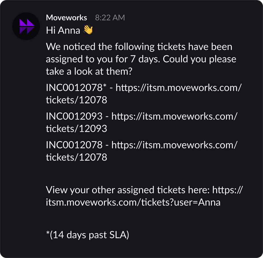
Plaintext messages are difficult to understand. There are no affordances to help a user digest the information provided.
❌ Plaintext
✅ Rich Chat
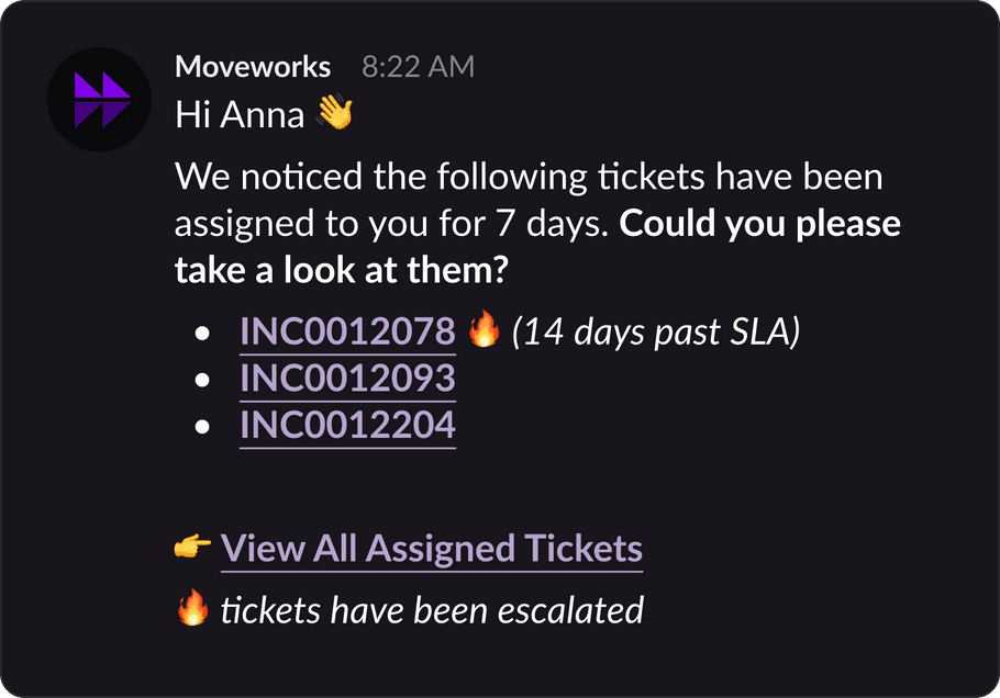
To prevent experiences like the above, Moveworks has provided the following markup elements. These will work on any chat platform your employees use.
Keep it conversational
When messaging users, keep the tone of your message conversational. Make sure to use emojis to increase the visual appeal of your message.
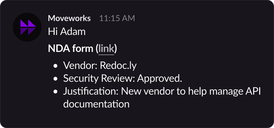
❌ Impersonal Notification
✅ Personal Message
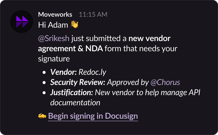
Being conversational increases your integration's adoption rate and improves overall employee satisfaction. Refrain from using technical jargon, dumping error codes, or listing out details without instructions or suggestions.
Reduce information density
Emails are often littered with complex tables & banner images.
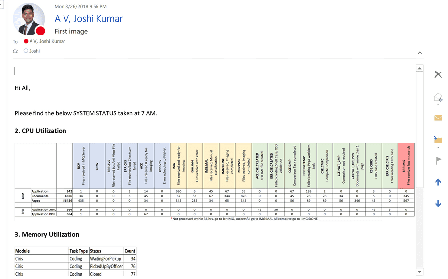
There's a concept in user interaction design called Progressive Disclosure. When designing for chat, making sure you display just the right level of information is critical to success.
Ask yourself:
What will the user do with this information?
For example, purchase orders can contain a lot of logistical information & IDs that are not relevant to approvers. Crafting the right message is the difference between users loving your integration or ignoring your it.
❌ Noisy Message
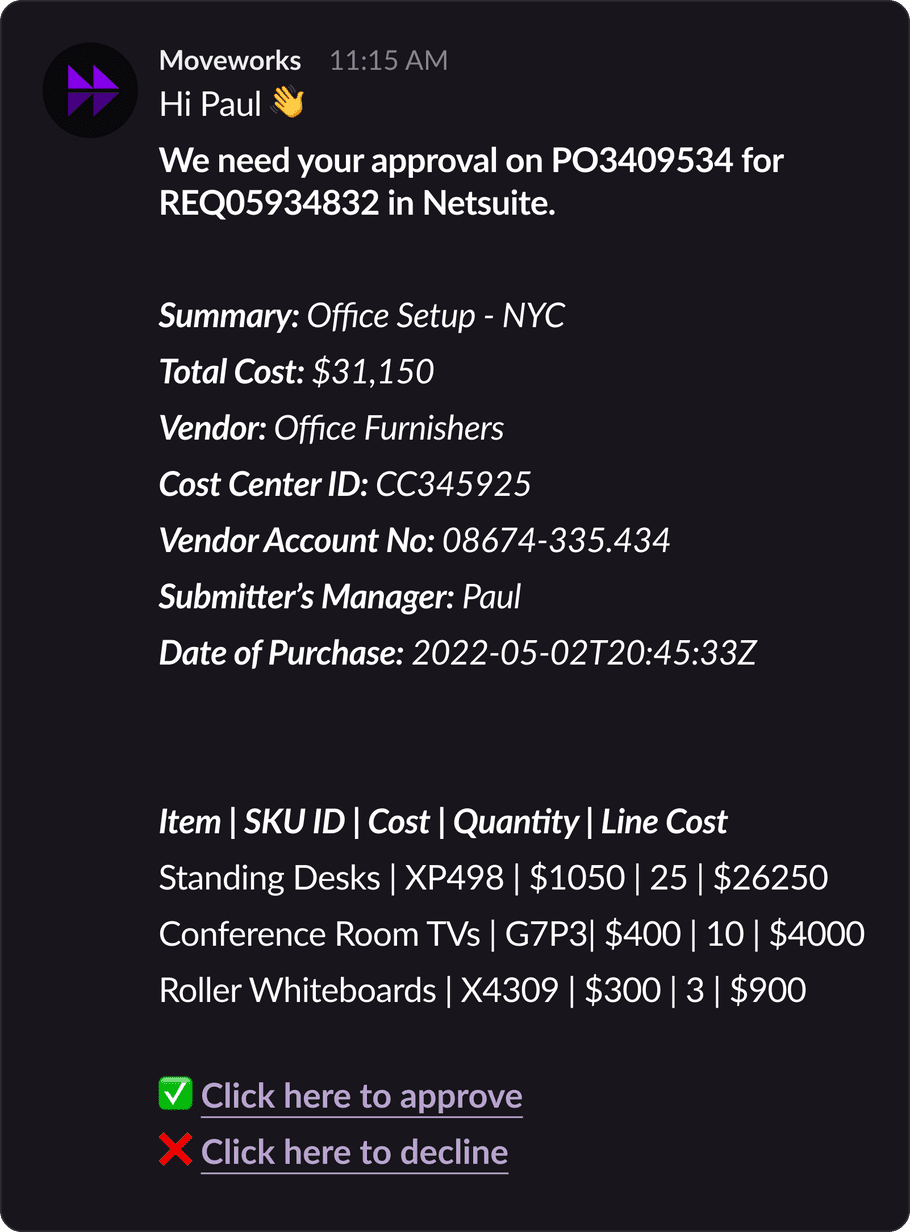
✅ Concise Message
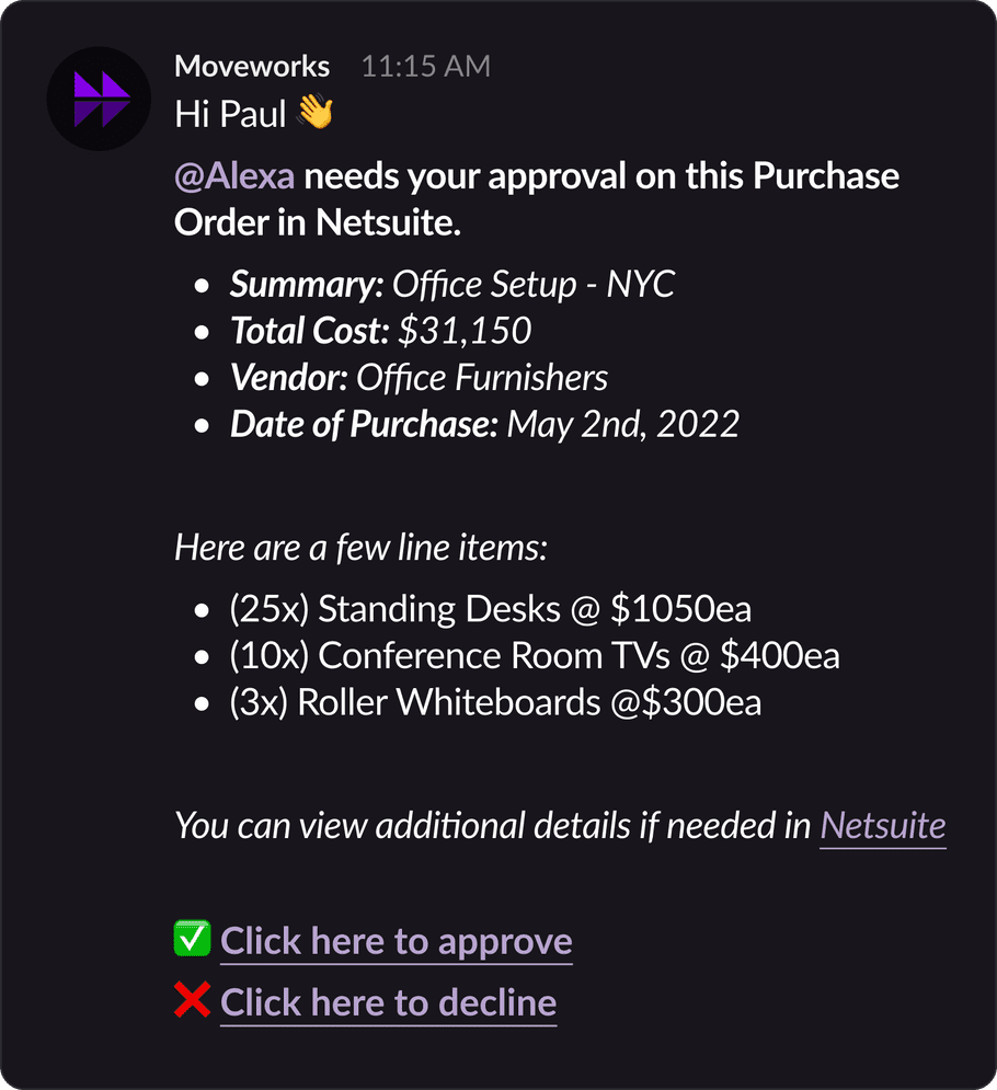
Need help?
Try out our Purple Chat Builder to design your own mock!